
Designing a sponsorship application module within a corporate education portal
A Note on Transparency
The organization operated an employee-facing education portal used by corporate partners to provide access to academic programs, sponsored programs, and additional learning benefits.
The portal functioned as a centralized access point where users could:
The initial request appeared simple: Add a new section within the existing Sponsored Programs area where users could apply to open program cycles. However, defining the workflow revealed deeper operational complexity.
The system needed to support:
This was not about inserting a static form. It was about designing a structured intake mechanism inside a live, multi-stakeholder operational environment.
The objective was not simply to design application screens, but to structure a complete, end-to-end sponsorship experience that balanced user clarity with administrative efficiency.
Before moving into high-fidelity design, I defined the underlying architecture of the flow. This included organizing how open program cycles would be grouped and displayed, determining which fields were mandatory versus conditional, mapping required documentation, and identifying what administrators needed for effective pre-screening.
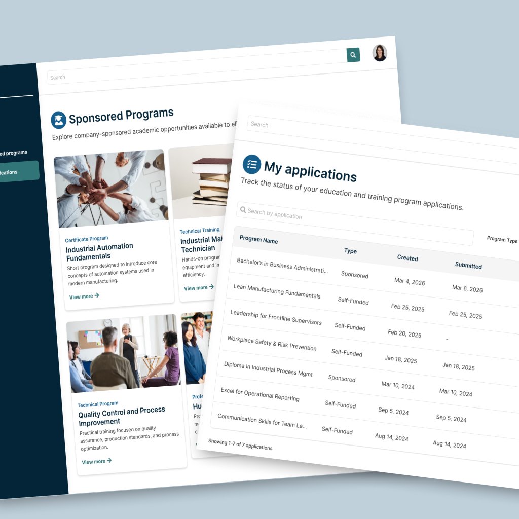
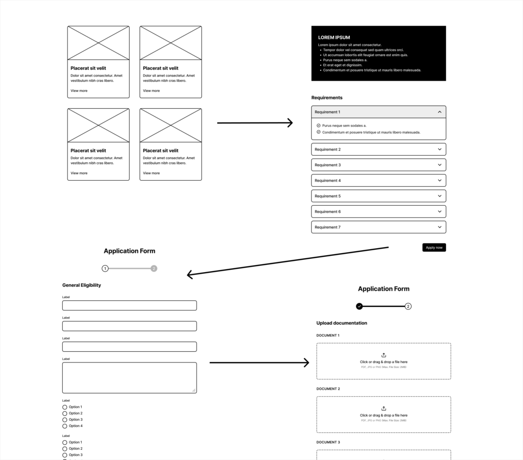
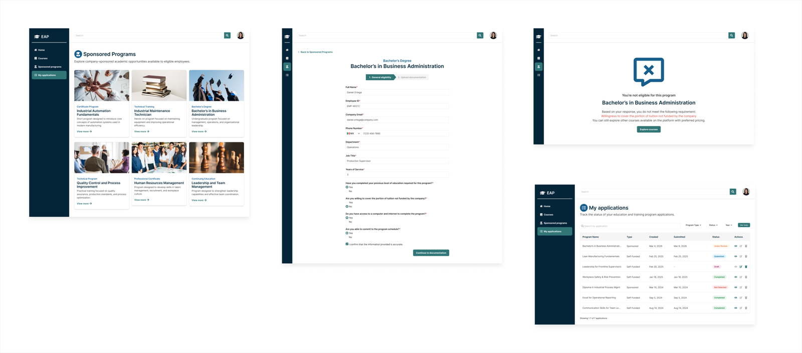
The final solution introduced a centralized Sponsored Programs view where users could browse available sponsorship cycles and access detailed program information. From there, the experience transitioned into a guided multi-step application flow designed to progressively collect information while minimizing friction.
The structure followed a clear progression: eligibility validation, personal and program-related details, document submission, review, and confirmation.
Form logic was intentionally structured to reduce ambiguity and prevent incomplete submissions. Conditional field visibility ensured users only saw inputs relevant to their situation. Required versus optional indicators were clearly defined, inline validation provided immediate feedback, and document uploads were grouped into structured categories to improve clarity and completion confidence.
Rather than overwhelming users with a single long form, the multi-step progression created a sense of control and forward movement, improving clarity and hierarchy.
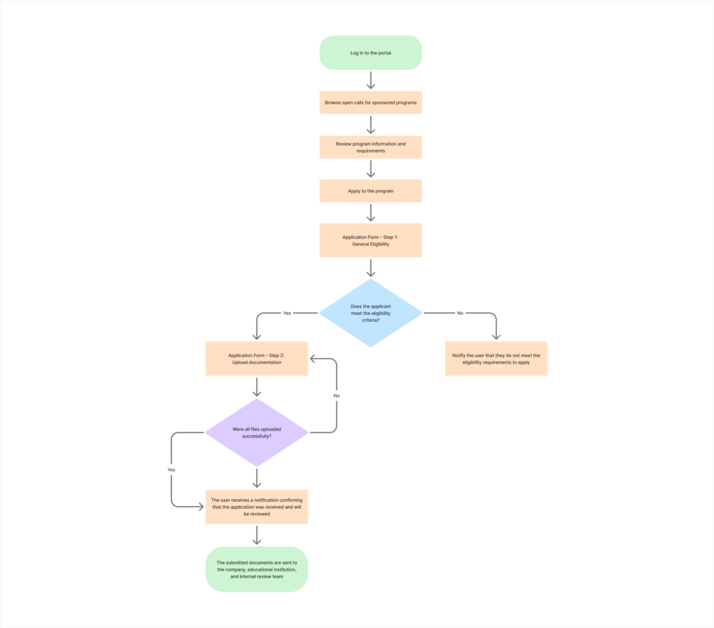
This visual communicates controlled progression, validation logic, and structured information hierarchy across the full application journey.
Beyond submission, visibility across the application lifecycle became a critical component of the experience.
The redesigned “My Applications” section provided a centralized overview where users could track all submissions in one place. The structured table enabled users to monitor application status, distinguish between sponsorship-based and self-funded programs, identify missing documentation, and access relevant next actions when required.
This transparency reduced uncertainty, minimized repetitive status inquiries, and reinforced user confidence in the process.
From an operational standpoint, the structured data presentation improved internal filtering, streamlined pre-selection workflows, and created traceability across application stages.
The module improvements: